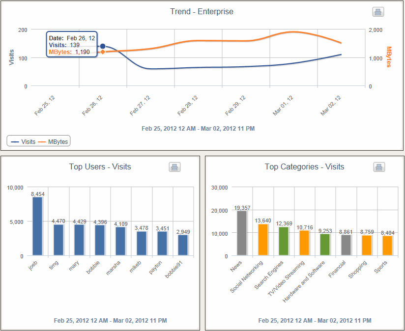
The CyBlock Cloud service dashboard provides multi-perspective, high-level trend and bar charts. A number of these ‘quick-look’ displays depict Web-use activity trends from a variety of perspectives. Others compare activity between users, groups, content categories, and sites. The Dashboard’s easy-to-interpret charts provide an efficient way to quickly determine the amount and characteristics of Web activity and identify problems that may exist.
Dashboard Home
Get a quick overview of your entire organization’s Web activity. Spot spikes in visits and bandwidth. Identify top users and most visited categories.
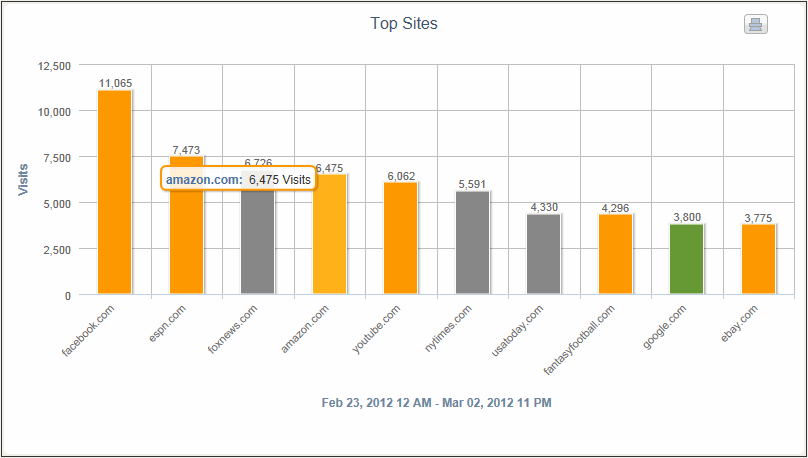
Top Sites Visit Chart
Find out which ten sites had the most visits for the time period you specify.
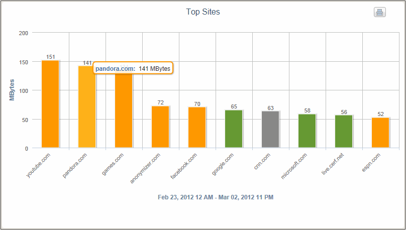
Top Sites Bandwidth Chart
Find out which ten sites are consuming the most bandwidth for the time period you specify.
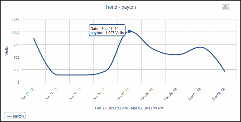
User Trend Chart
View Web-use visits, hits, or bytes over time for users, groups, categories, and acceptability classifications.
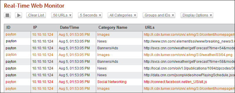
Web Monitor
View Web activity in real time by user ID, the full clickable URL, and its category. Filter on users, groups, or categories to be displayed.
